
VitaGuide
(February 2024 - March 2024)
The Project
This is a concept for a hypothetical nutrition and food tracking app. The goal was to streamline the process of adding a meal to their tracker while also providing them with additional information regarding their chosen item.
In this project, I once again played the dual roles of UX Researcher and UX Designer.

Case Study
Preliminary Research
User research was conducted by way of a survey of 10 people, aged between 20 - 55 years. The survey was geared towards assessing attitudes surrounding food tracking apps and uncovering user pain points with those apps.
Two personas were created based on the survey results to account for the two major themes that arose from the survey. Sanjay encompassed concerns from people who were looking to track their food intake to gain or lose weight. Josephine, on the other hand, embodied users who had dietary restrictions and were looking to ensure they were able to get the proper nutrients.
A competitive audit was done with the most popular food and nutrition tracking apps. While all provided the same essential functions in completing the target user flow (adding a meal to the tracker), two apps stood out in terms of features and branding. MyFitnessPal blends nutrition with exercise and features a database of exercises the user can access. Noom offered the most comprehensive tracking options as it first assessed the user’s dietary needs and restrictions; it advertises itself as being empirically backed. Each competitor had basic accessibility options in the form of a Dark Mode or High Contrast Mode display feature.

The Close-Up Storyboard

The Big Picture Storyboard

User Flow

The first Persona, Josephine

The second Persona, Sanjay

The User Journey Map
The LoFi Model
I approached this design initially with a minimalist viewpoint; I wanted to simplify the process, with as little clutter as possible while still providing the user with all the relevant information. Initially I wanted to cement the navigation as being present at all times somewhere on the screen, though I then did choose to incorporate the hamburger dropdown as an alternative way to navigate through the app. I had to make concessions with my minimalist approach as there was too much information that would be neglected if I relied solely on imagery alone. The end result I felt did accomplish both goals.

Sketches for the Home Page

Sketches for the Tracking Page

Sketches for the Goals Page

Sketches for the Database Page
From the initial paper wireframes, the LoFi Digital wireframes were created. The prototype was then built using the digital wireframes and a usability study was conducted to evaluate the design. The feedback from the usability studies then influenced the HiFi mockups and prototype.

The Home Page
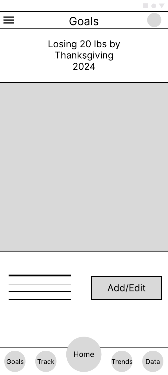
The Goals Page
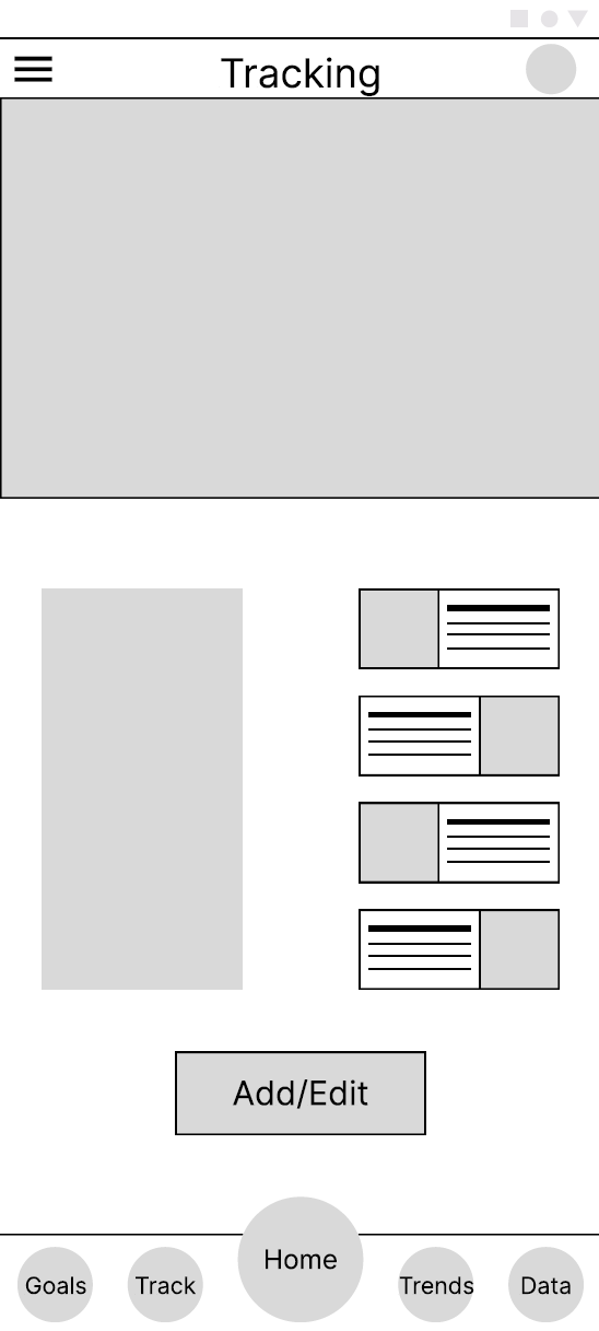
The Tracker Page
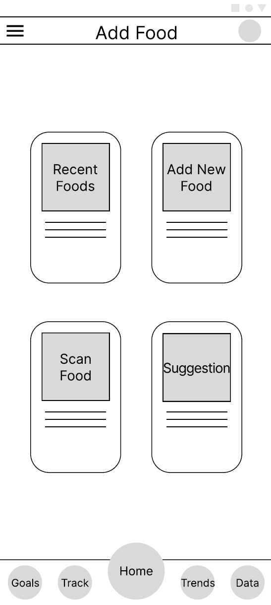
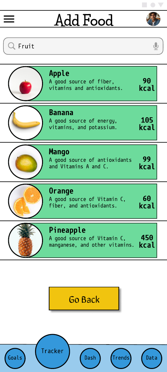
The Add Food Page

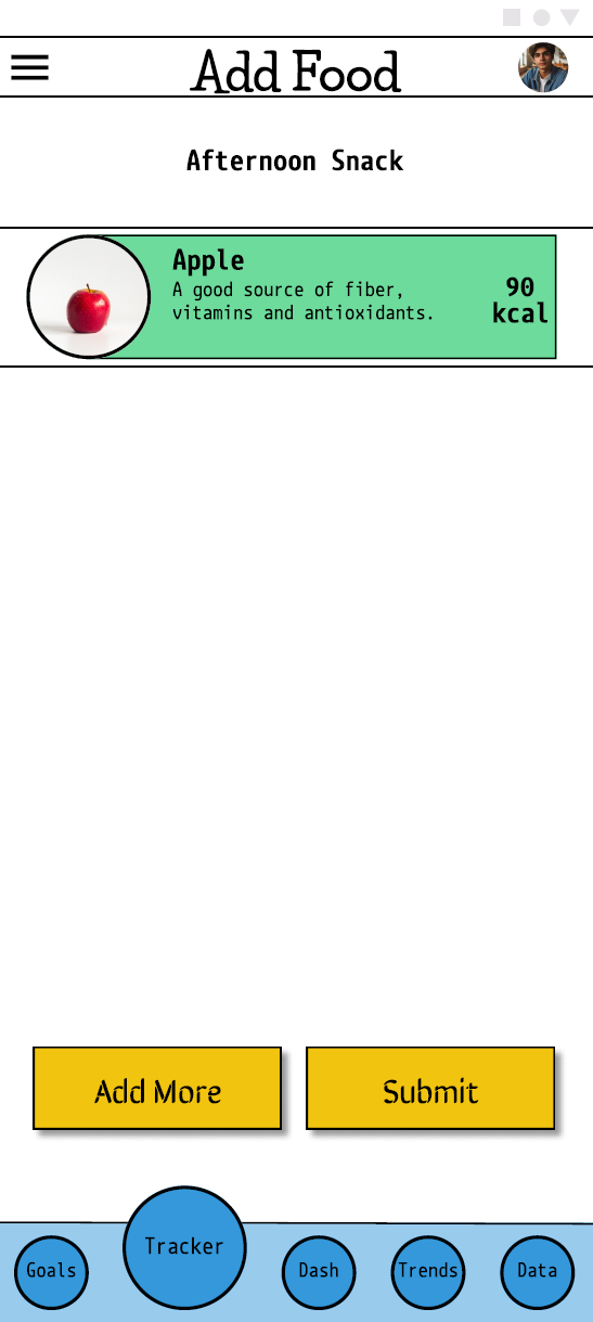
Add Food (cont.)
Add Food (cont.)
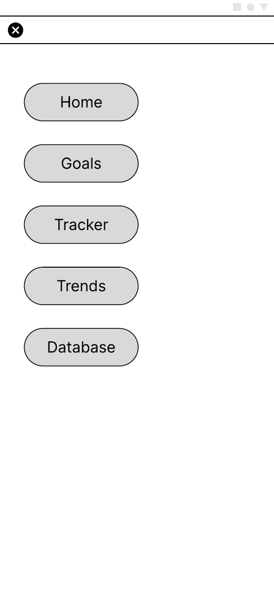
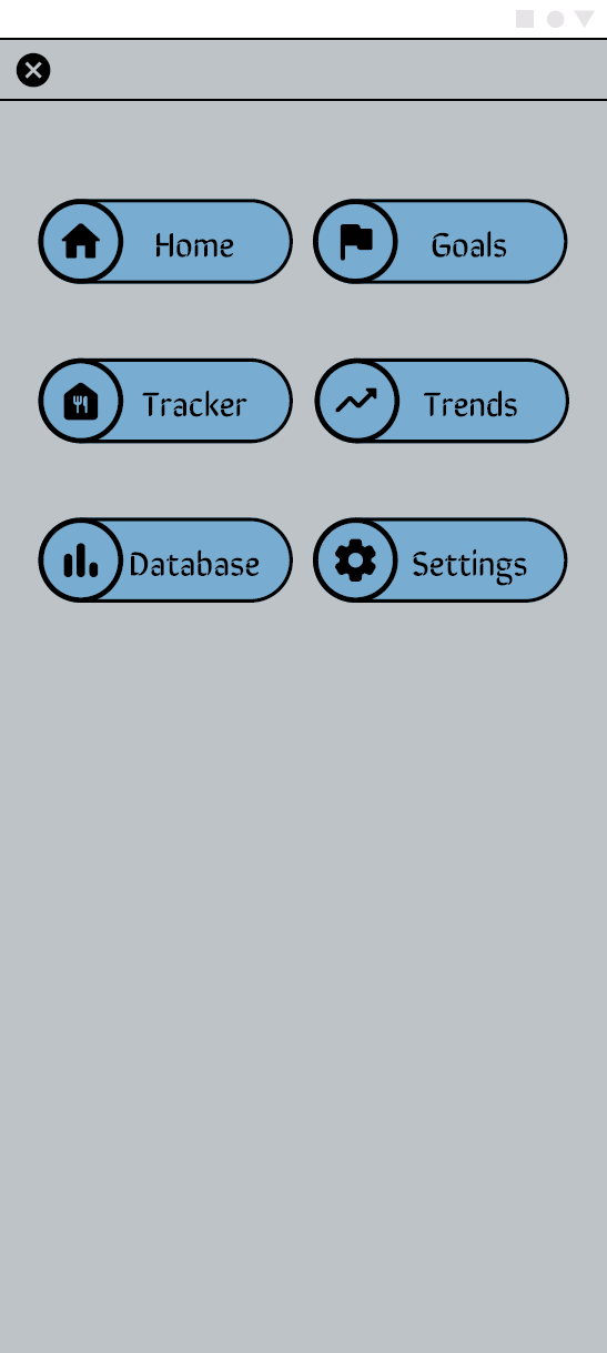
The Navigation Menu Overlay
The HiFi Prototype
A usability study was administered to 10 people and yielded some important insights. Approximately the same number of users utilized the hamburger menu for navigation as those who used the navigation menu located at the bottom of the screen. Since there was no clear preference for one over the other, I decided to leave both as they were for the final product. One adjustment I made to the navigation menu was adding a visual cue so users would know which screen they were currently on. As I began working on the HiFi Mockups, I created a Sticker Sheet to help save time and establish consistency across screens.
Overall, users found it simple to complete the task, though they noted that the inclusion of Back button would benefit the process a lot, as they would have to start the process all over if they, hypothetically, went to the wrong screen or wanted to edit something. With regards to the brand, I wanted to incorporate imagery related to nature along with a matching color palette. The idea of the tracker and goals resembling hikes would help convey to users that they are on a journey and that each step brings them closer to a seemingly insurmountable goal.

Home Page Mockup
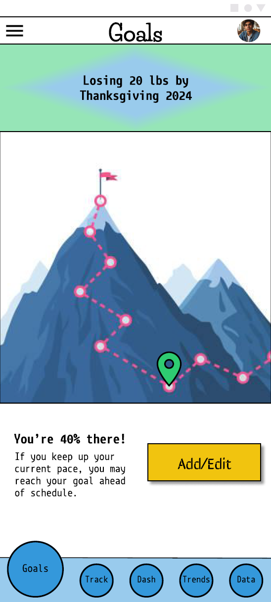
Goals Page Mockup
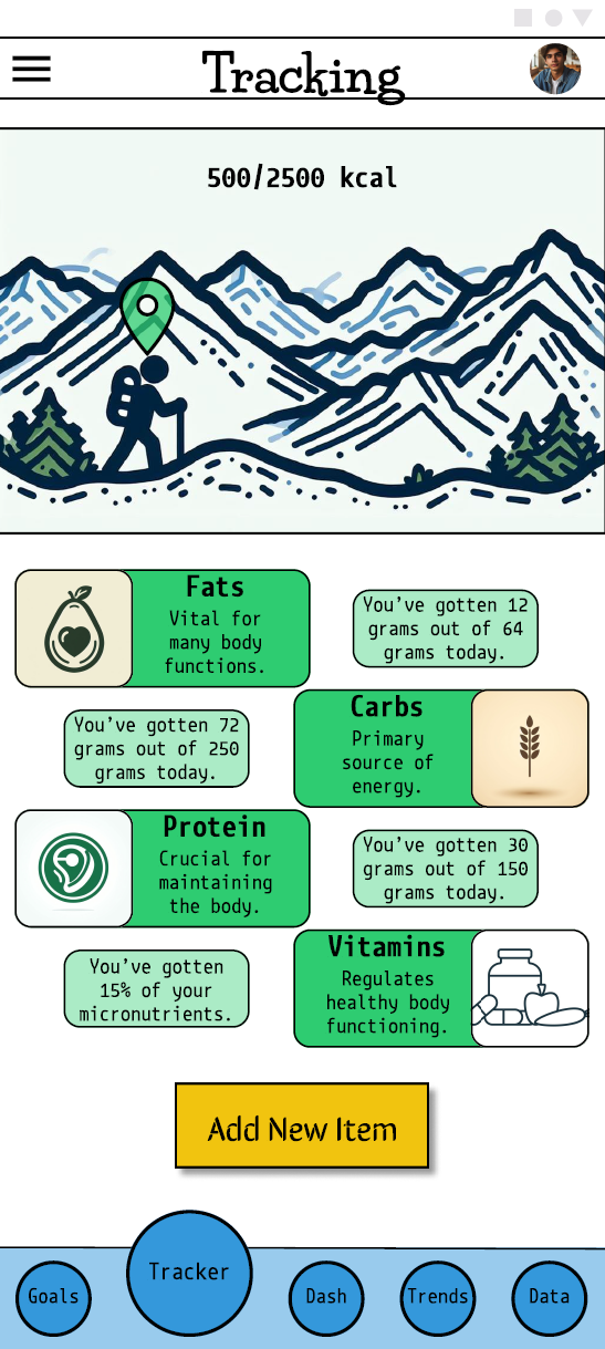
Tracking Page Mockup

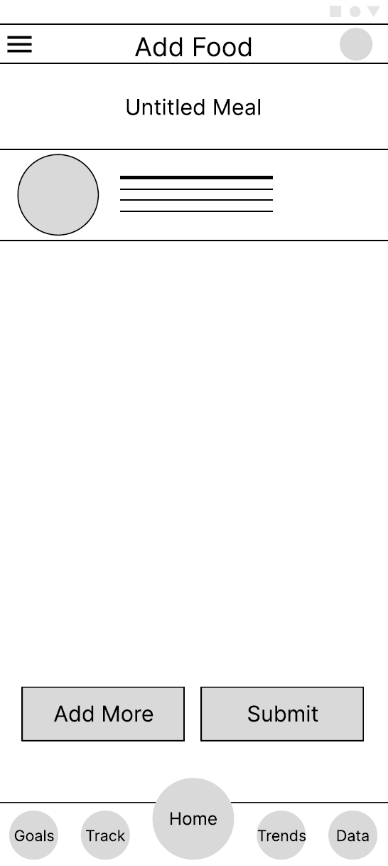
Add Food Page Mockup
Add Food (cont.)
Add Food (cont.)
Navigation Menu Mockup
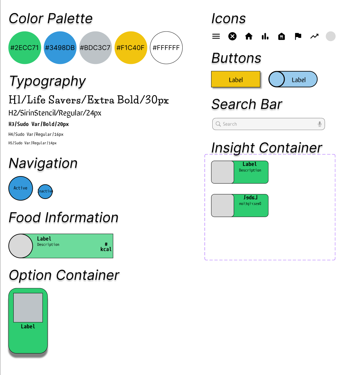
The Sticker Sheet used for this Project


Takeaways
This design helped me further practice creating for mobile screens. In practicing with limited space, I feel I am getting better with making good use of the real estate available to me. I do think that for my next project, I should focus on a desktop design. With this project I also gained experience with creating and using a Sticker Sheet; while this was tedious to create initially, I saw the value in having this as a resource when making the mockups.
Despite still finding myself harboring some doubts and questioning some design decisions, I find my confidence growing as I ease into this role. The feedback I get from user surveys and usability studies definitely confirms that designs are addressing user pain points and creating for a positive experience. At the end of the day, it’s the user feedback that serves as the best evaluation of the design.
Results
The final design addressed user pain points and added more life to the LoFi wireframes. The user flow remained straightforward and streamlined. Some areas to improve upon are primarily related to accessibility.