
Desi Me Rollin’
(April 2023 - November 2023)
The Project
This is a concept for a hypothetical food truck specializing in rolls based on Indian cuisine. The goal was to provide users a simple and straightforward way to place mobile orders.
As one of my very first projects. I played the dual roles of UX Researcher and UX Designer.
Case Study
Preliminary Research
User research was conducted by way of a survey of 7 people, aged between 20 - 45 years. Utilizing the data from the user surveys, I created two personas that encompassed the concerns outlined by those surveyed. Leon, a busy professional pressed for time who needs to be able to place and pick-up large orders efficiently, and Kimberly, a young college student always on the lookout for popular food spots.
A competitive audit was done to compare and contrast direct and indirect competitors. One key finding from the audit was that none of the competitors had a dedicated mobile app; however, they did all have a mobile version of their site, though this was limited to the functionality of the original desktop site.
The LoFi Model
In designing the LoFi model, I wanted to emphasize the areas highlighted in the competitive audit as strengths while also including features that were missing. Due to the mobile nature of food trucks, I found it integral to include a map screen for users to locate the nearest location to them. Several iterations of each screen relevant to the user flow were sketched out in the paper wireframes displayed below.
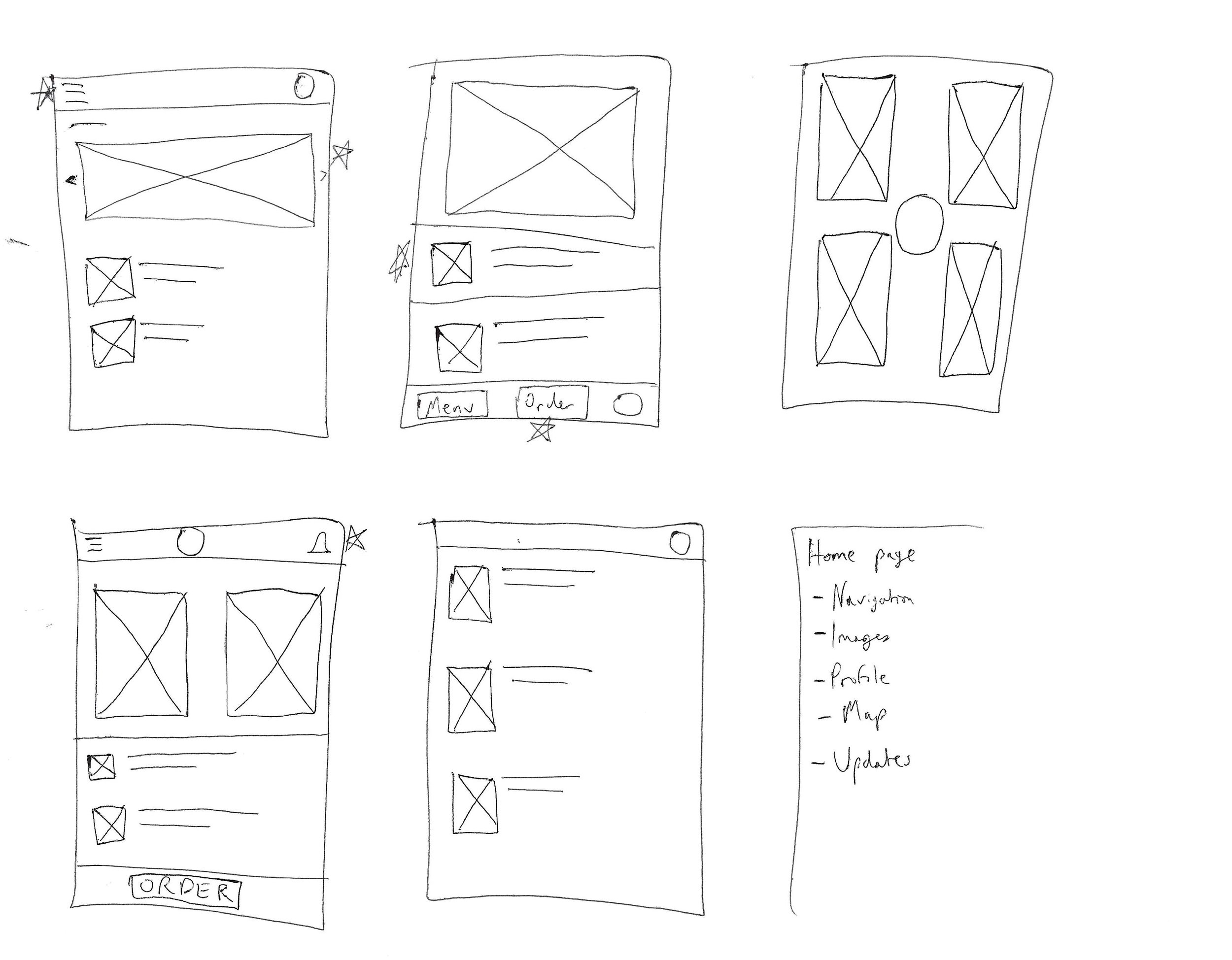
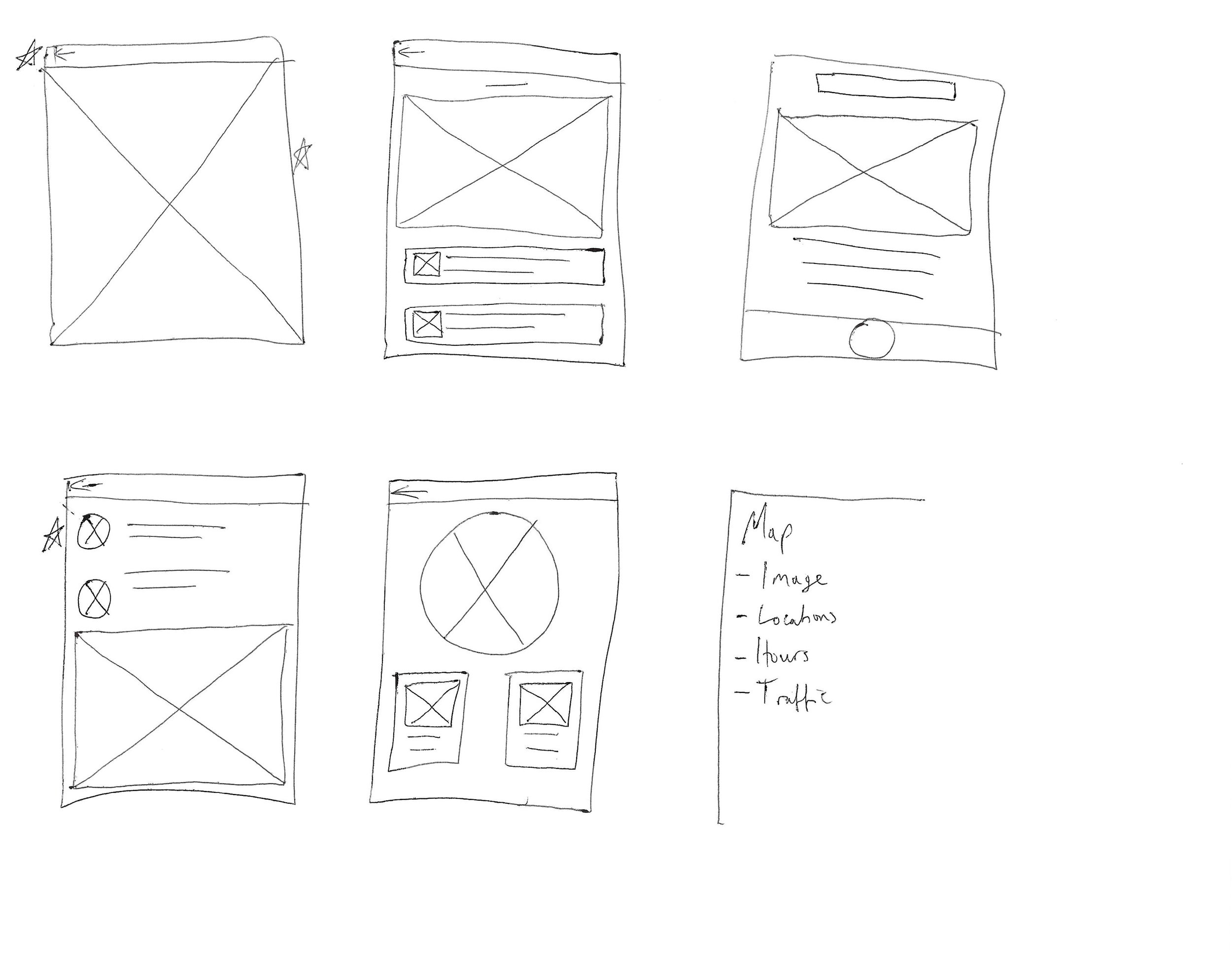
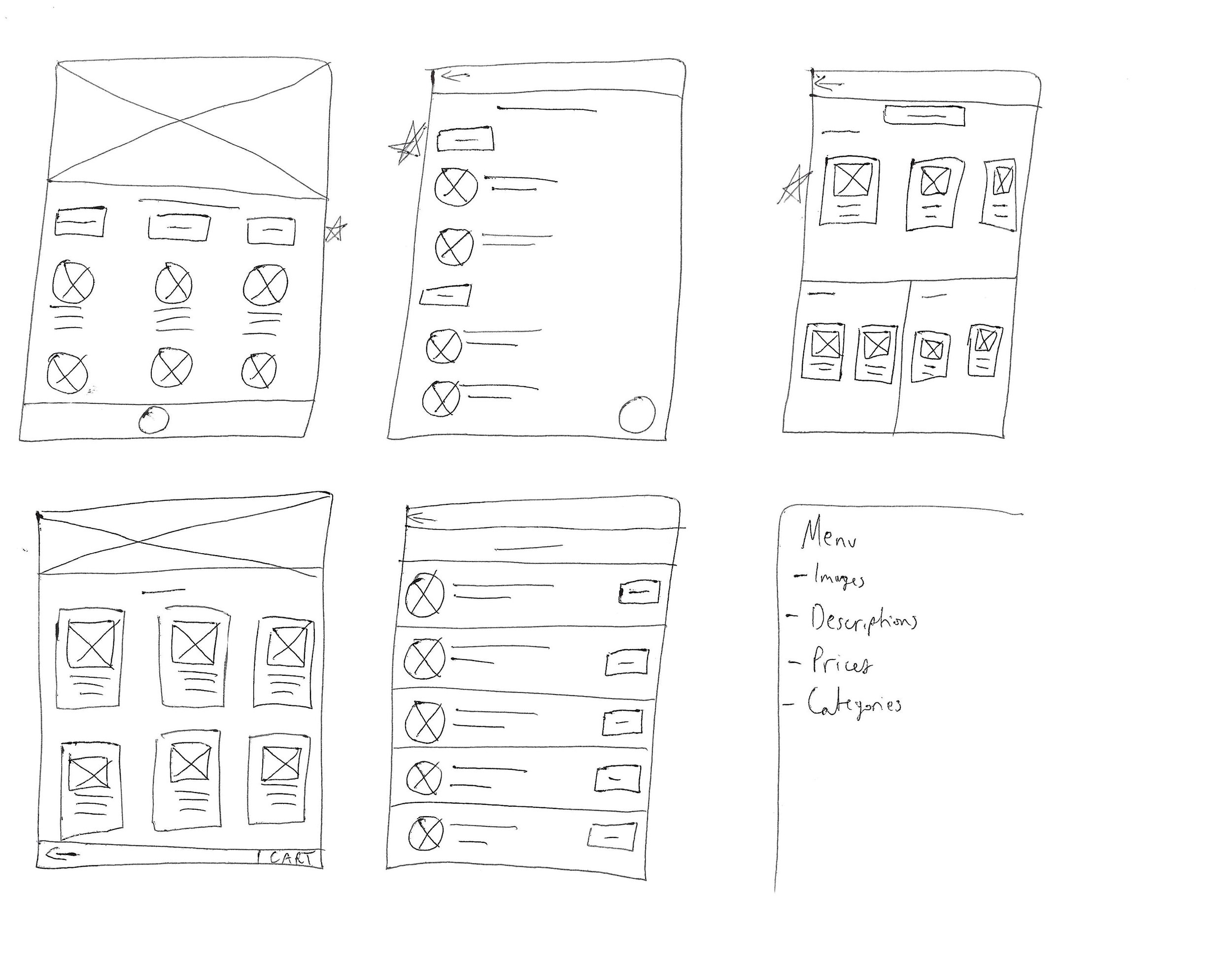
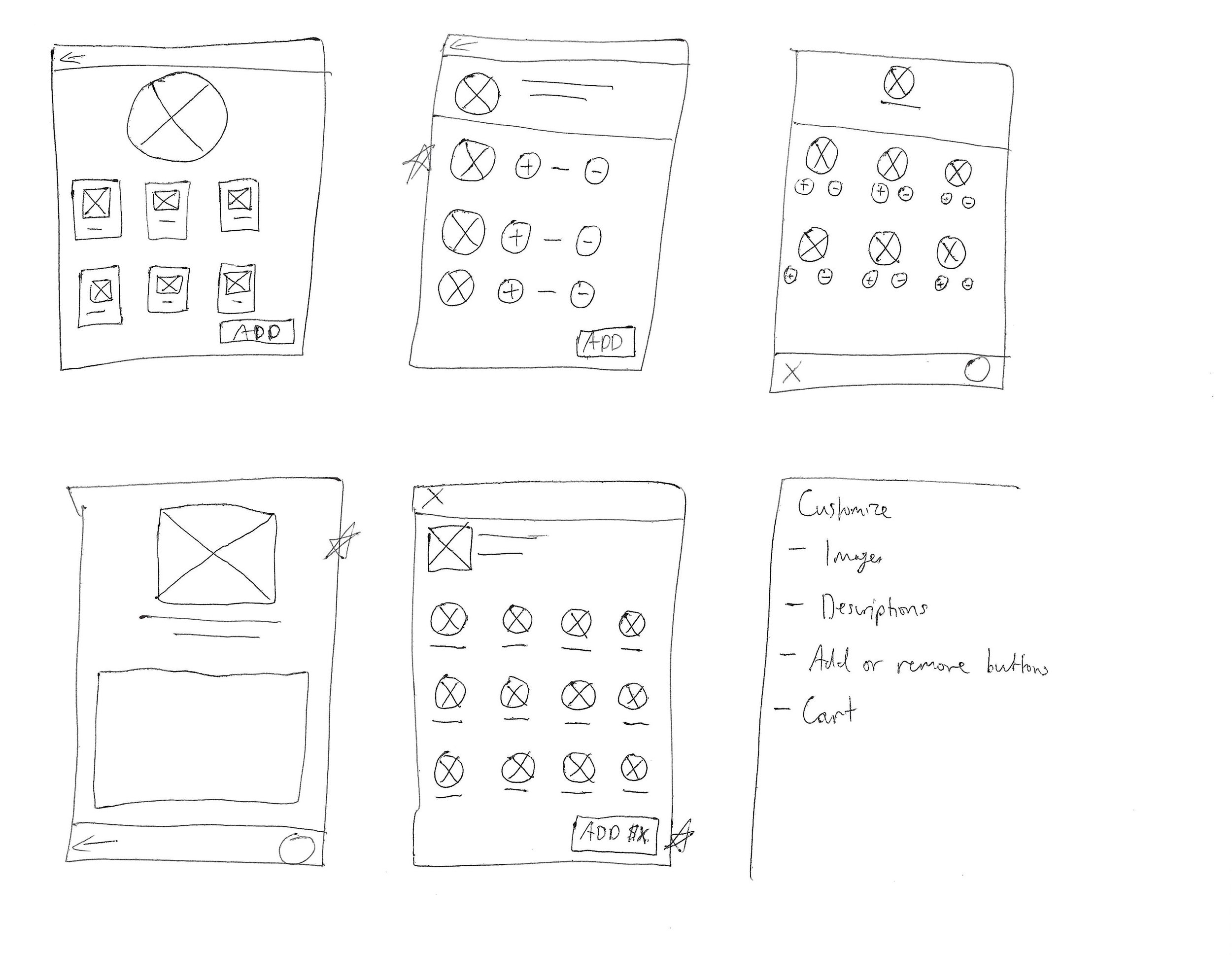
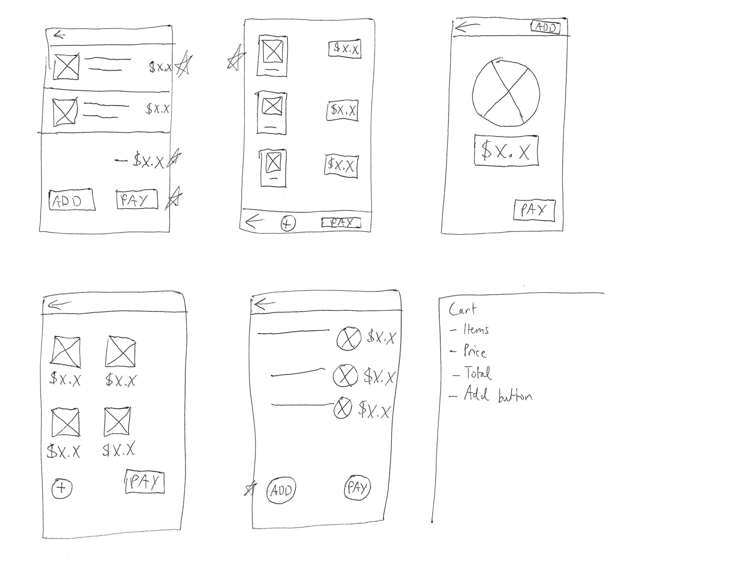
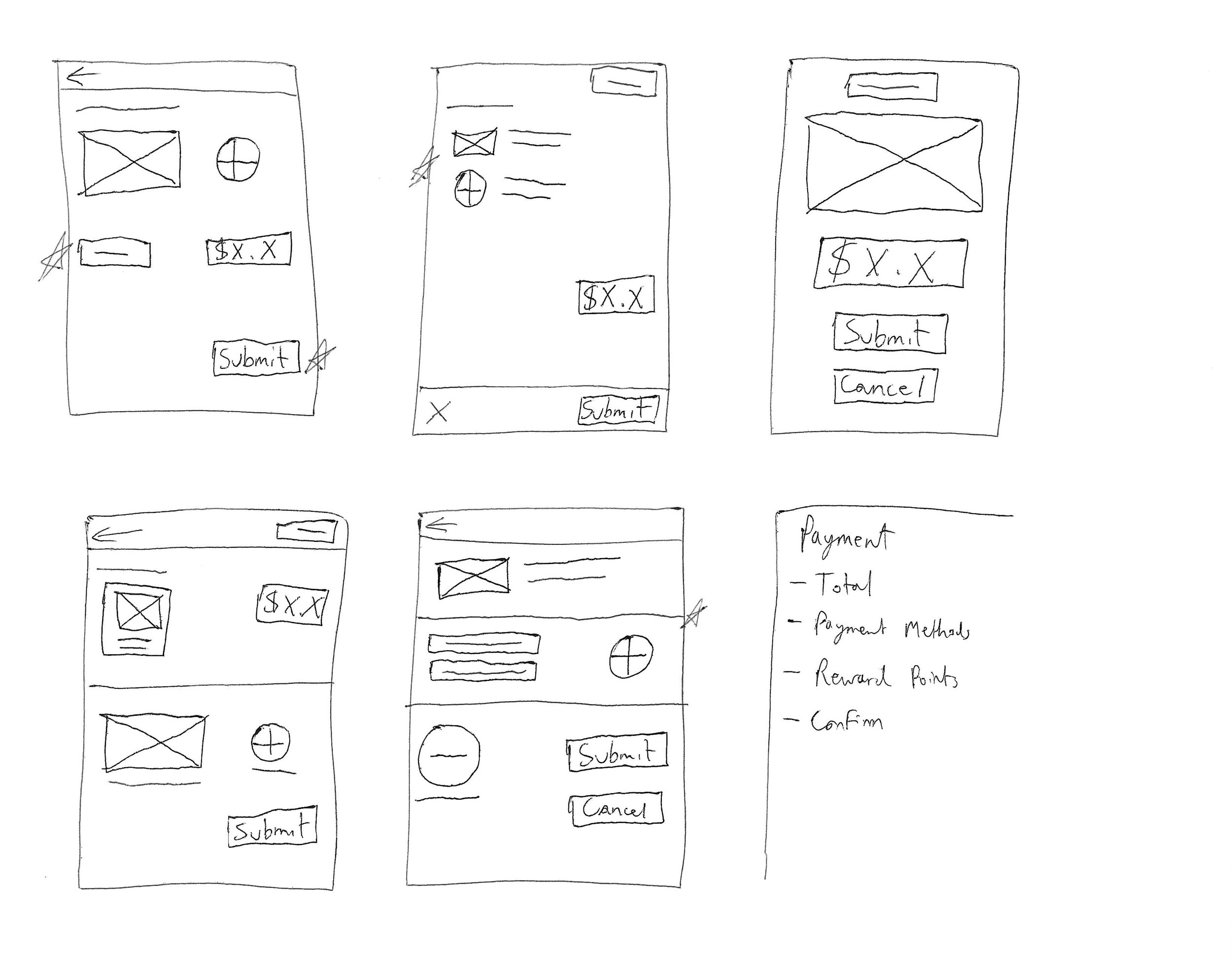
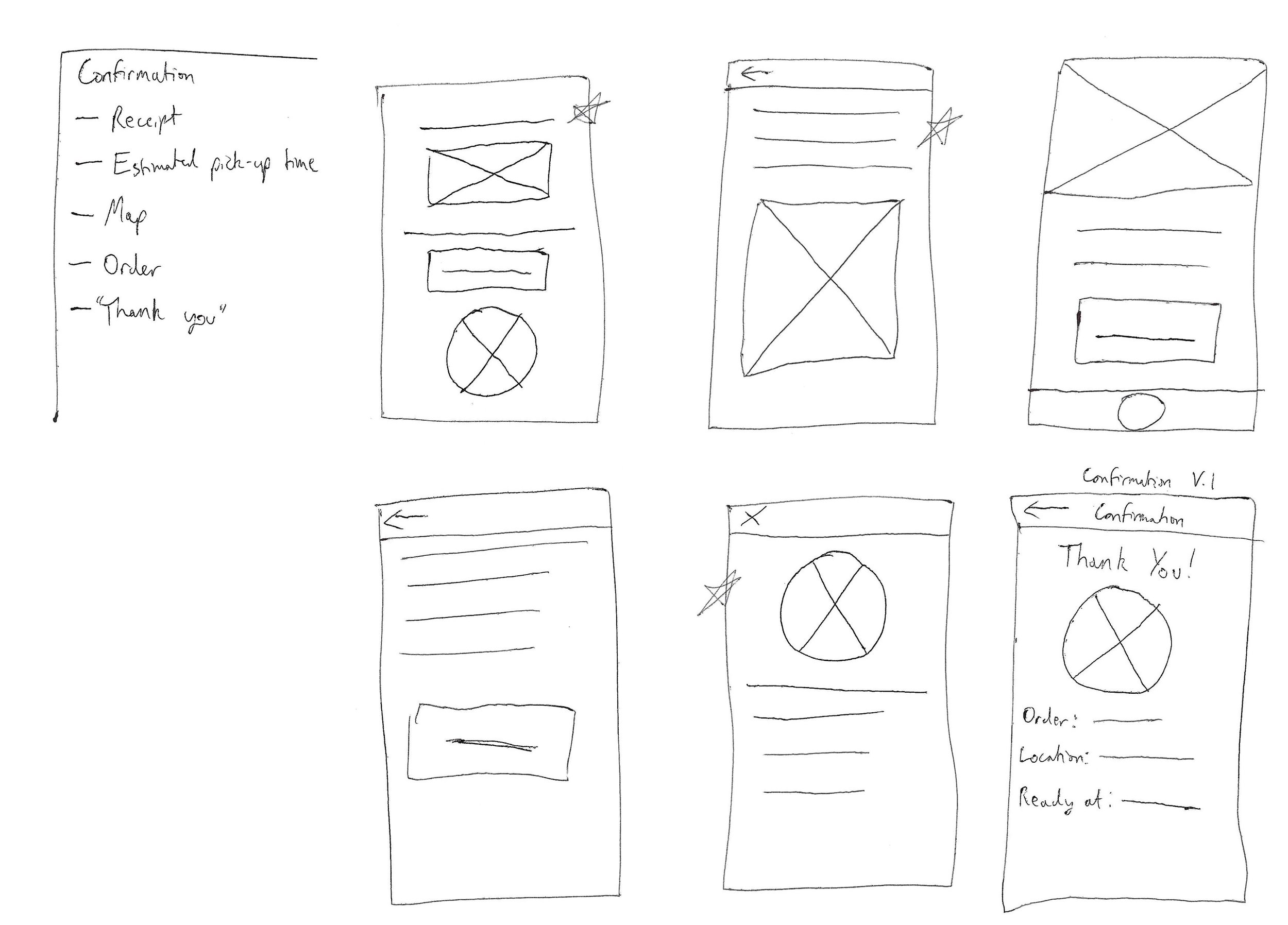
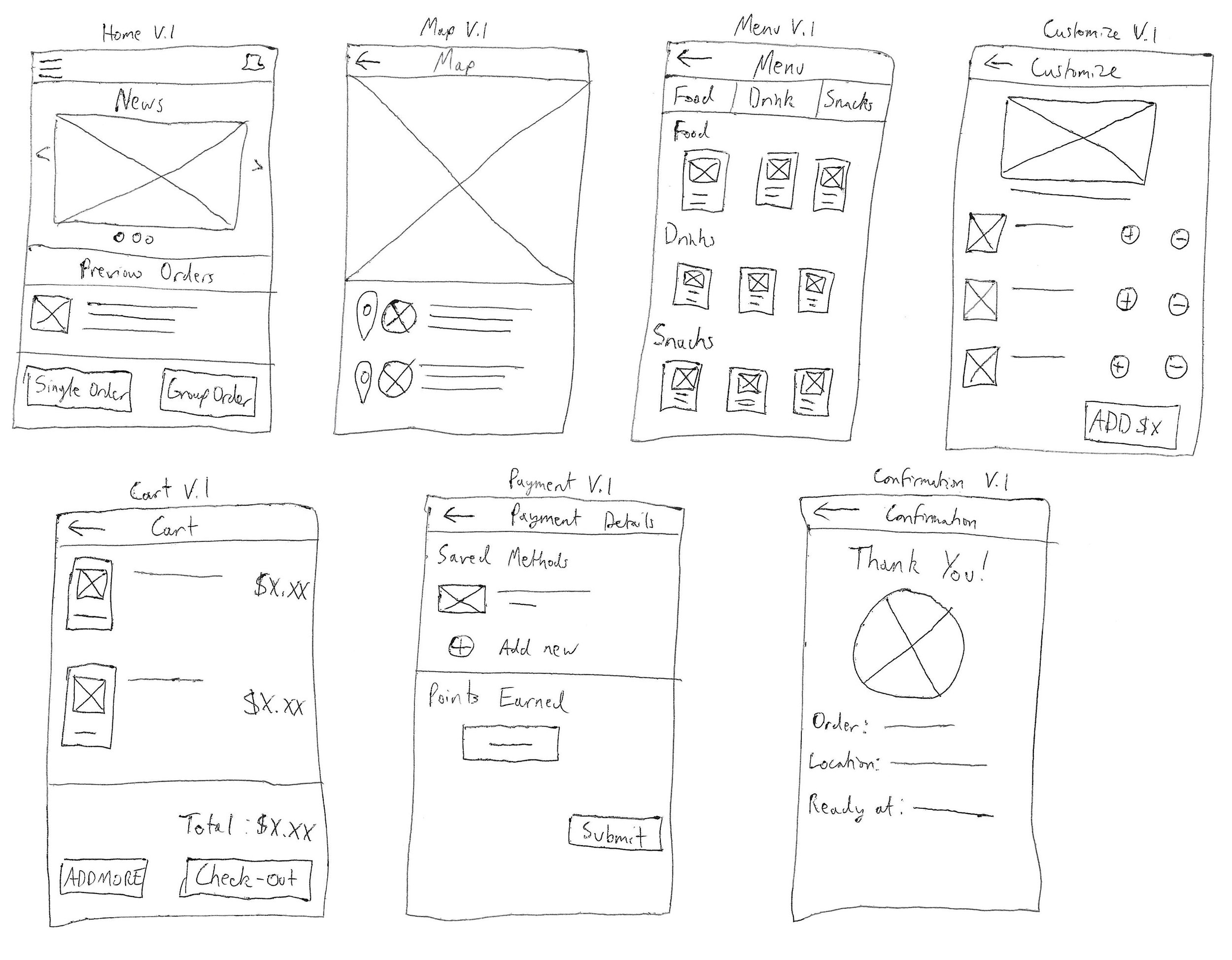
Five ideas were sketched out for each screen; elements from each draft that stood out to me were highlighted and then incorporated into a final composite. The composite versions of the paper sketches then served as the initial skeletons the digital wireframes would build off of. The digital wireframes for the main screens of the user flow are displayed below.
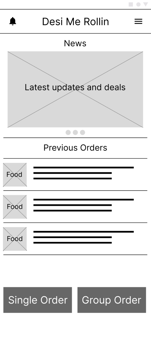
The Wireframe for the Home Page
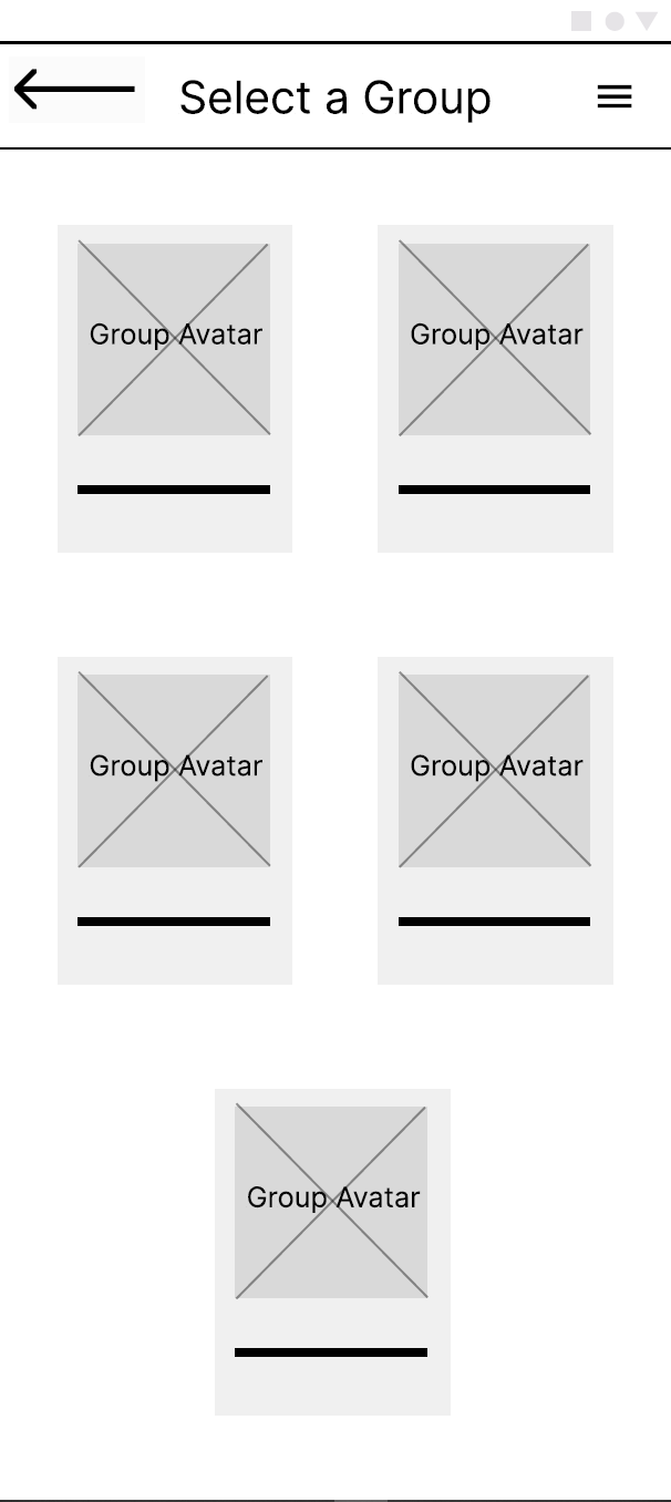
The Wireframe for the Group Page
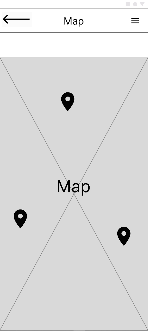
The Wireframe for the Map Page

The Wireframe for the Menu Page
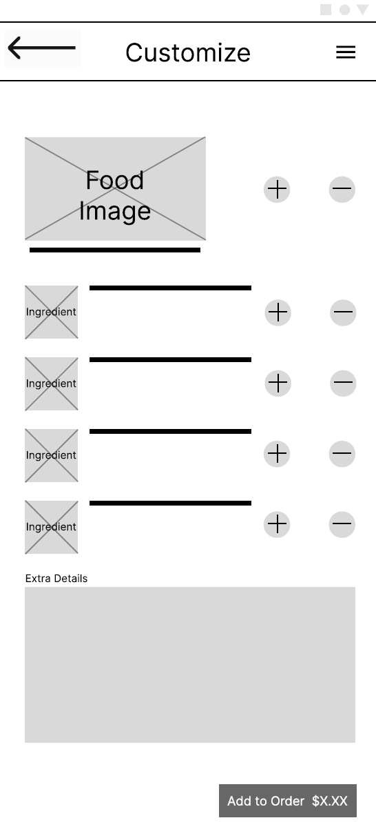
The Wireframe for the Customization Page
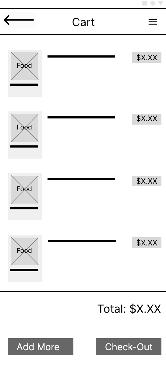
The Wireframe for the Cart Page
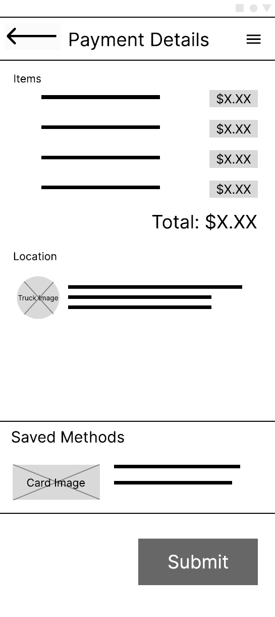
The Wireframe for the Payment Page
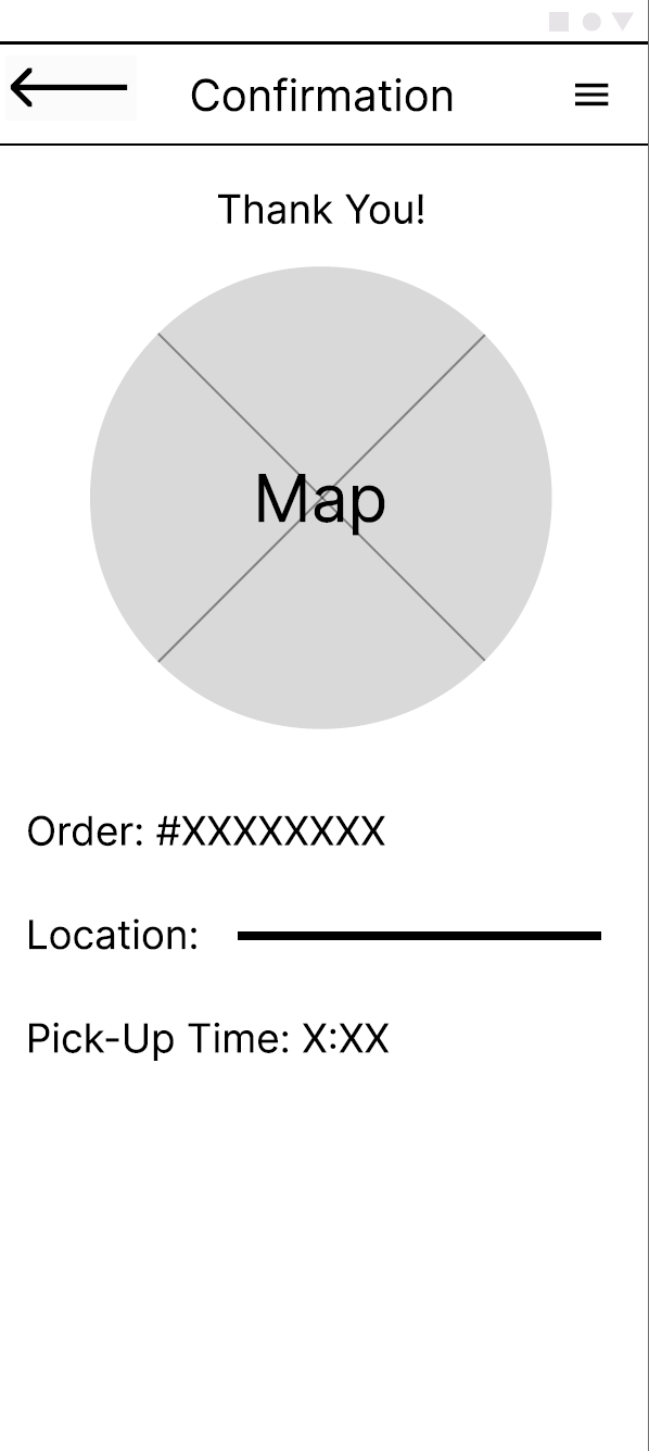
The Wireframe for the Confirmation Page
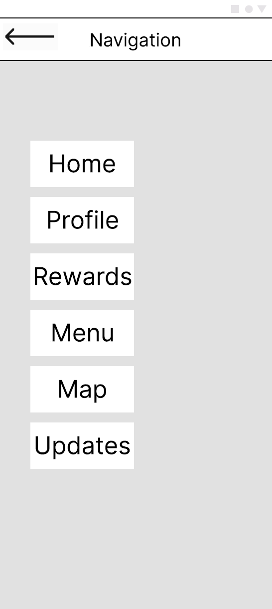
The Wireframe for the Navigation Menu
The HiFi Prototype
The first component of the HiFi prototype I focused on was the color palette. Seeing as how I was designing an app for a food truck specializing in South Asian food, I used colors reminiscent of South Asian culture. Through usability studies and user feedback, I was able to refine the mockups so that the user could complete the ordering process more efficiently. For example, rather than including two separate buttons for ordering food, I condensed them into one singular call to action button. As for menu items, the containers for each option originally was a solid background; this was updated to include a slight gradient in order to break up the monotony. Some general design concerns were also addressed, such as adding a text box to allow more freedom for customizing an order.
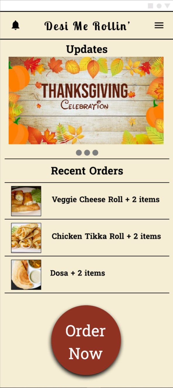
The Mockup for the Home Page
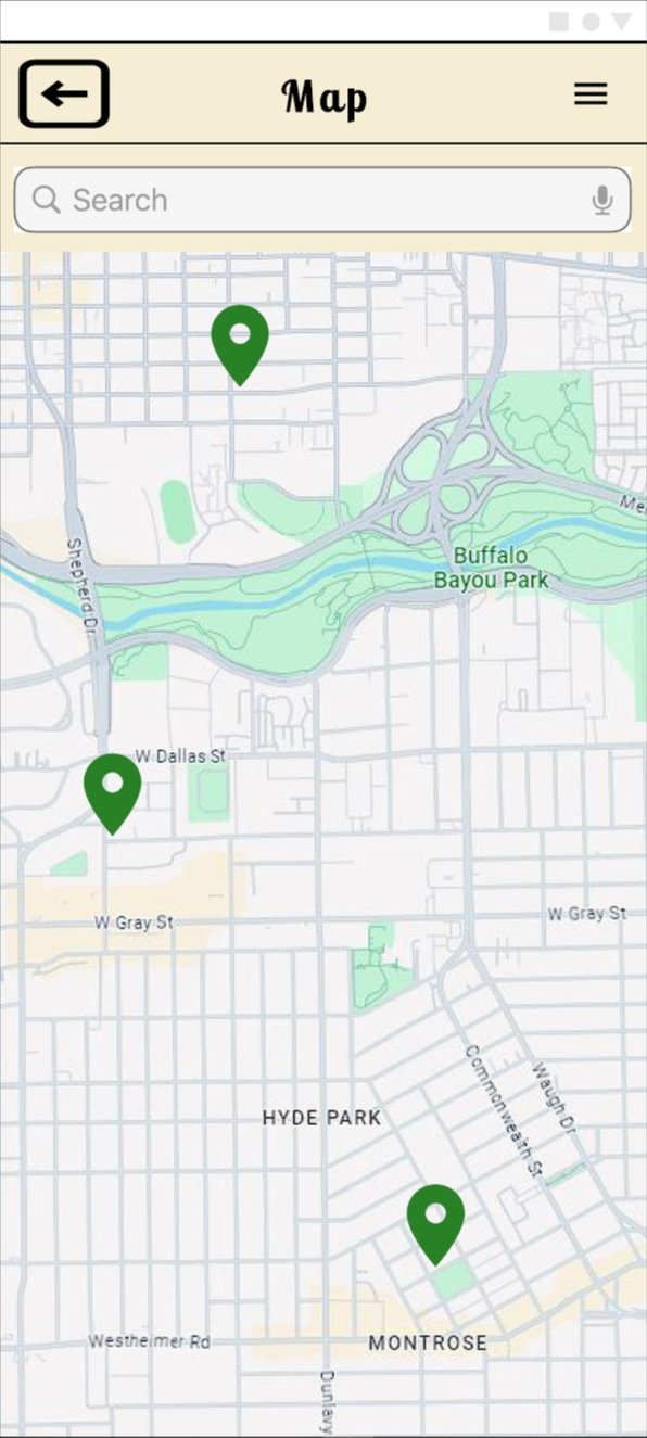
The Mockup for the Map Page
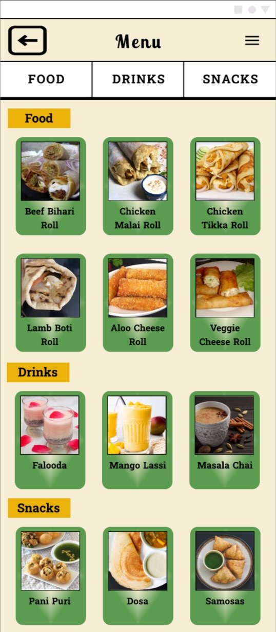
The Mockup for the Menu Page
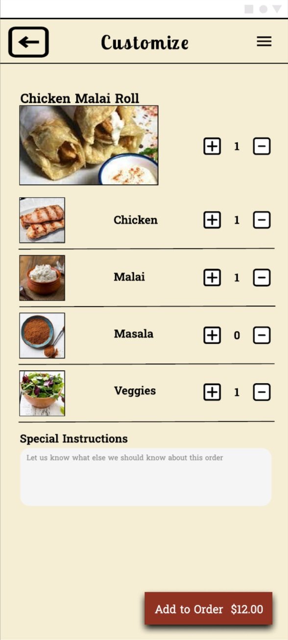
The Mockup for the Customization Page
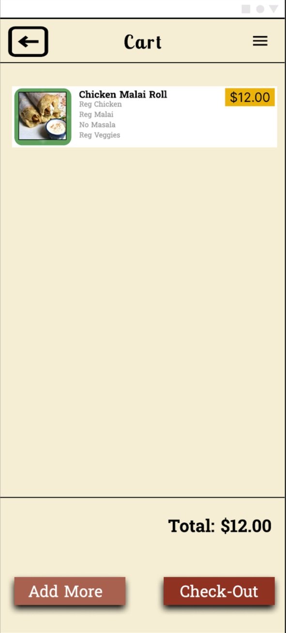
The Mockup for the Cart Page
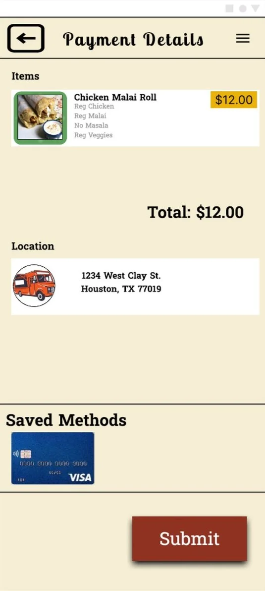
The Mockup for the Payment Page
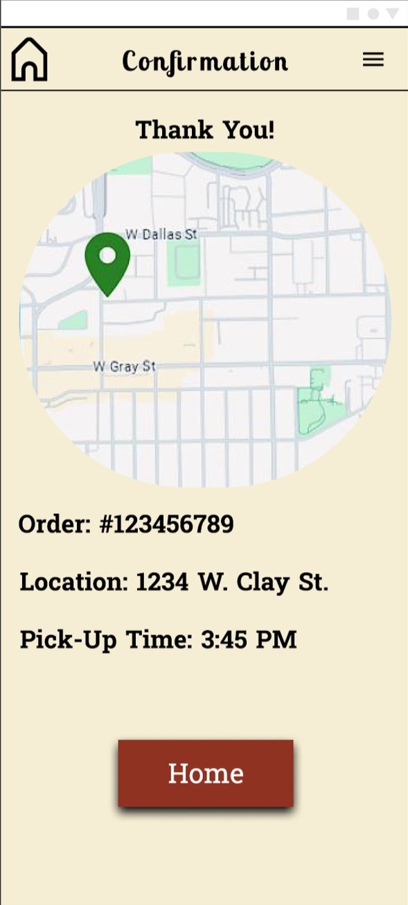
The Mockup for the Confirmation Page
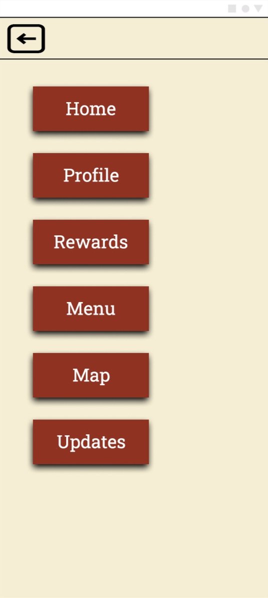
The Mockup for the Navigation Menu

Takeaways
This first foray into the formal UX/UI design process offered many learning opportunities. Staying in line with my clinical background, I found that designing and conducting the research was easy to grasp. Understandably, the most challenging aspect was creating the designs. While I had plenty of ideas, ones I considered unique and/or innovative, the practicality of those ideas tended to vary. At the end of the day, I had to remember that the design is meant to be USER centered and not ME centered.
The constant feeling that what I was designing was either “not good enough” or “too derivative” was present for most of the process. This can likely be attributed to my penchant for perfectionism, but the further I progressed and the more things came together, the less present those feelings were. Although there was always this sense that I could continue to improve upon the designs.
Results
The final product proved to be easier to navigate than the initial LoFi prototypes, with a majority of the feedback emphasizing the overall ease of the user flow. Areas to improve upon would likely revolve around ways to make larger scale orders in a more time efficient manner.


