
Task Master
(July 2024 - August 2024)
The Project
This is a concept for a hypothetical task list website. The goal was to create a digital version of a physical to-do list a person may use to cross of tasks as a person completes them and make it simple for users to do so.
Once again, I played the dual roles of UX Researcher and UX Designer.
Case Study
Preliminary Research
User research was conducted by way of a survey of 15 people, aged between 20 - 40 years. The survey assessed attitudes and concerns as they related to completing and organizing tasks. A follow-up interview was conducted with 5 randomly selected individuals from the initial group of 15 to further expand on obstacles and hindrances users encountered when it came to completing tasks. For the purposes of this project, the User Flow would be to mark one task as completed off of a specific task list.
Two personas were created to help conceptualized the user pain points. Andrea represented the portion of the sample that lived busy lifestyles and played a provider role to others. Diego represented the remaining portion of the sample that, while also busy, faced a different set of stressors in the form of regular deadlines (e.g. school assignments). Both personas would be faced with the challenges and obstacles that were disclosed by the interview participants.
The LoFi Model
With this project, I wanted to try to translate the physical act of crossing things off a list onto the desktop screen. How could I best mirror that physical action? With the extra real estate of designing for a larger screen, I found there was a lot of space I could utilize to achieve this vision. Keeping in line with the user feedback, I wanted the Lists screen (where all user created lists would be displayed) to provide users with a snapshot of all their created lists in one convenient location. Regarding the Task List itself, I knew I needed a way to display user progress in a quantifiable way so they could receive that instant feedback and decided to implement a progress bar that would update as the users marked tasks off their lists. Utilizing psychological principles, one key task here was to ensure that users found the act of completing and marking off tasks motivating and rewarding.
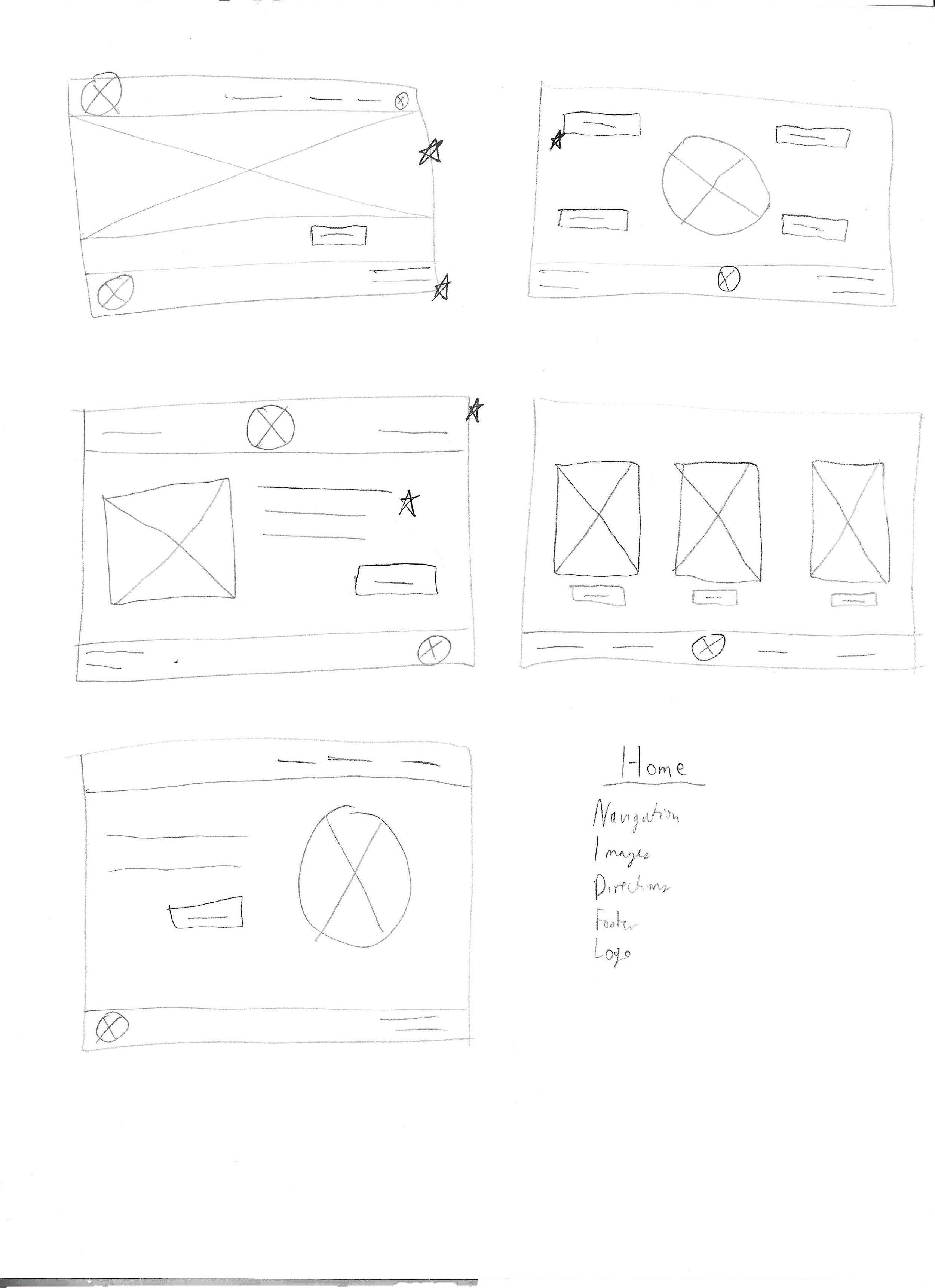
Home Page Sketches
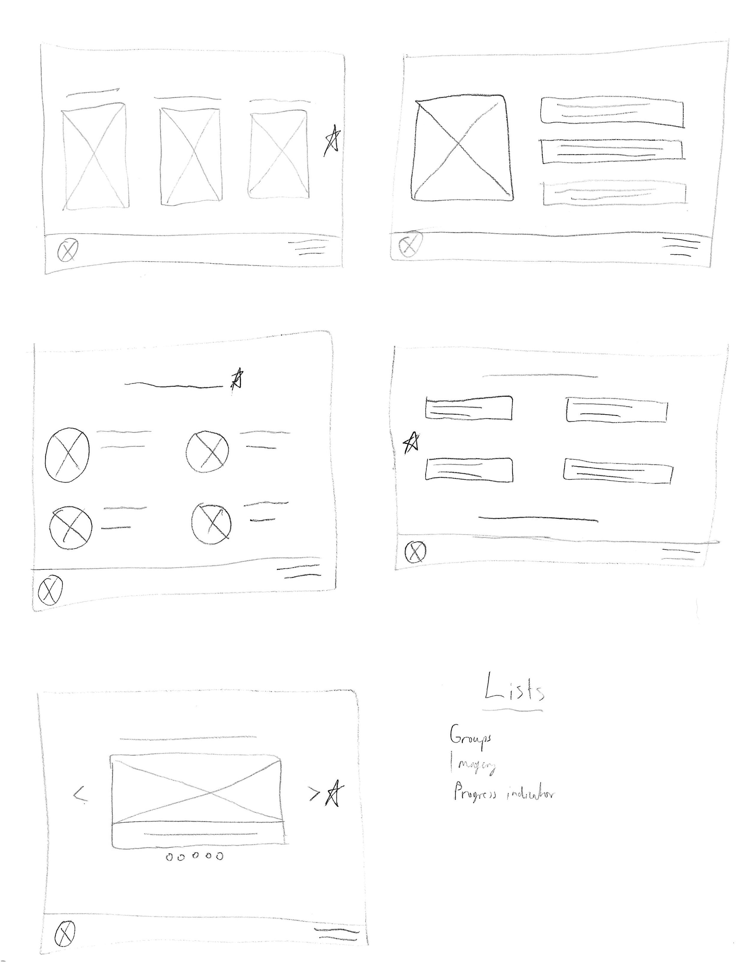
Lists Page Sketches
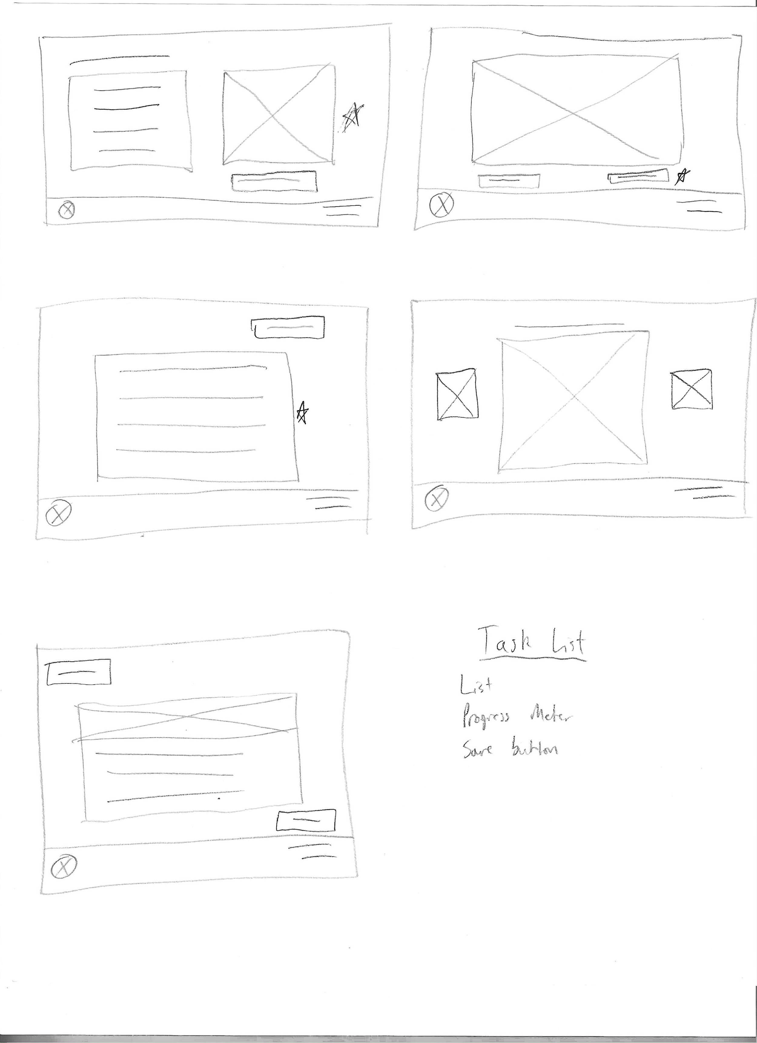
Task List Page Sketches
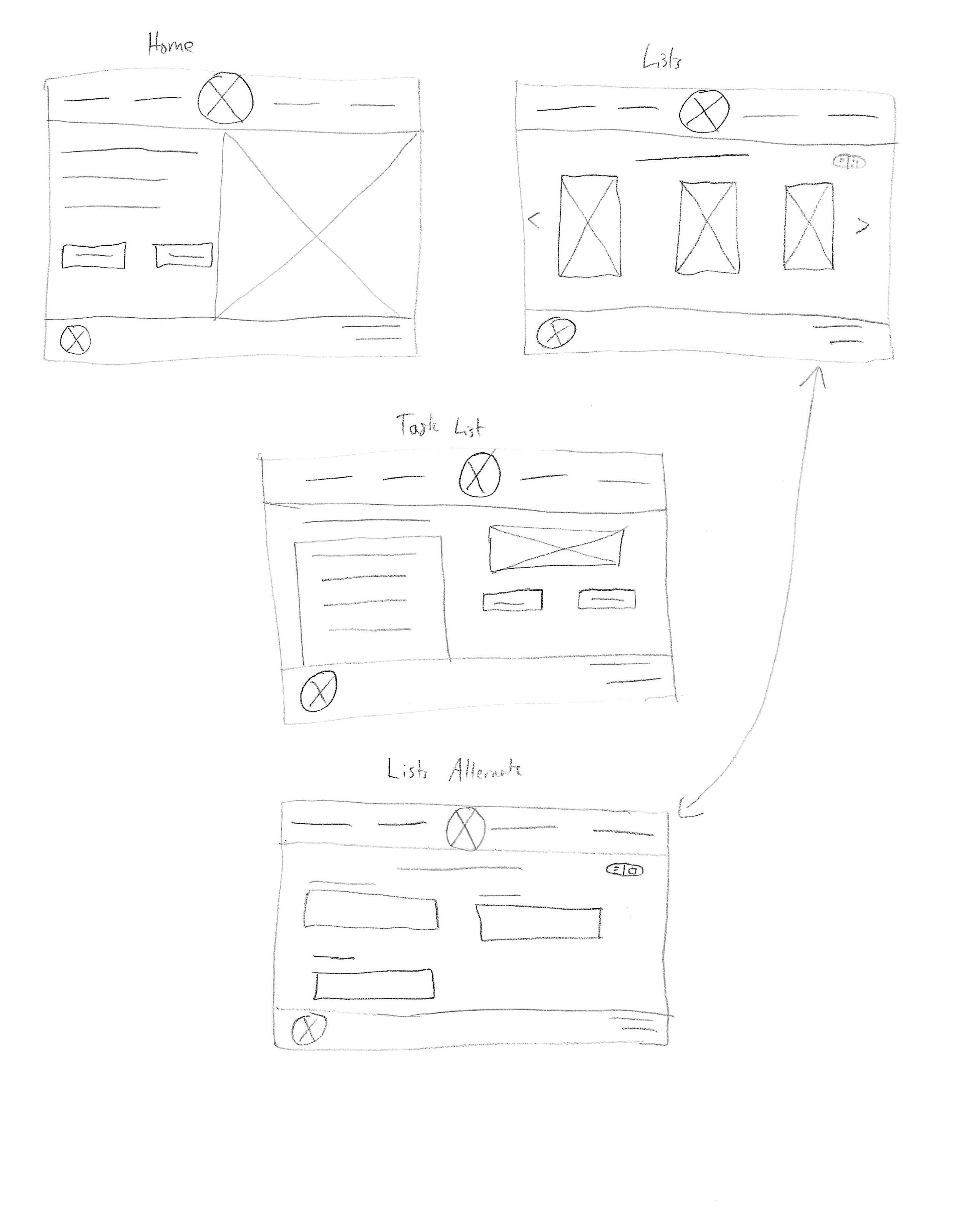
Final Sketches
I selected elements from various sketches to create a composite final version of each page, from which I created the LoFi Digital wireframes. With this project, I wanted to offer an alternative way to display a page, hence why there would be a way to display all task lists in either a grid or a list form. The navigation bar includes unexplored concepts for other areas of the site, such as a calendar where users can organize major tasks and deadlines. The LoFi prototype was then subjected to a usability study to evaluate the design and the feedback was utilized to build the HiFi mockups and prototype.
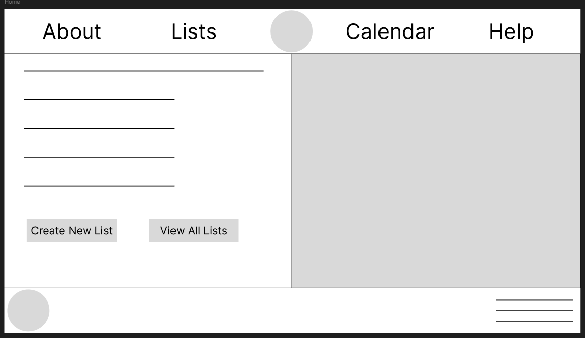
Home Page Wireframe
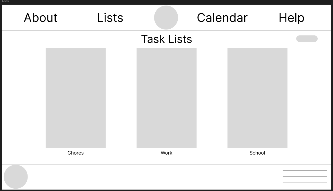
Lists Wireframe
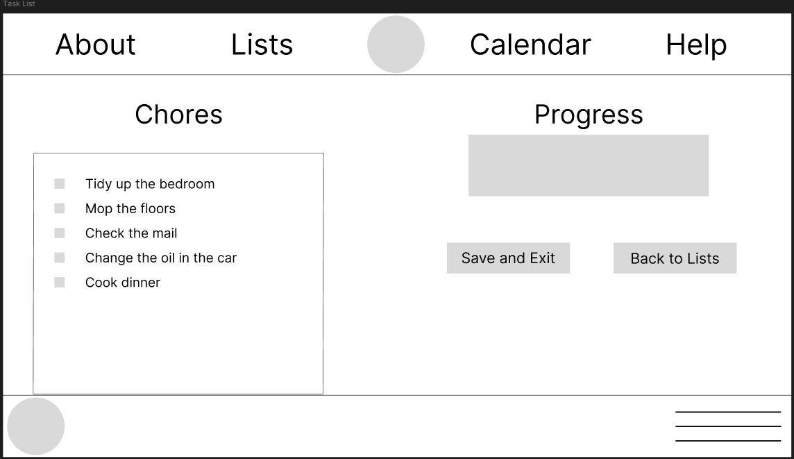
Task List Wireframe
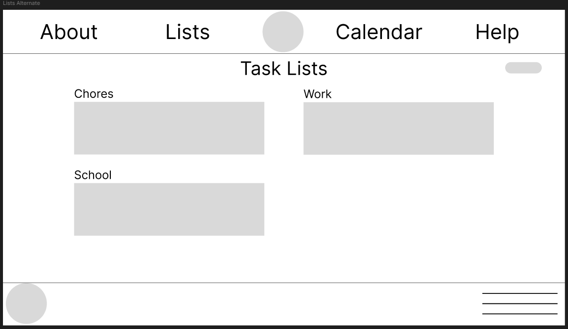
Alternate Lists Page Wireframe
The HiFi Prototype
A usability study was administered to 10 people. Overall, users were able to complete the user Flow with no issues. However, there was one user who was initially confused by the instructions and was unable to navigate past the home page but did eventually end up completing the user flow. Other feedback from users was related to including progress bars on the Lists screen so users could see how much progress they’ve made on other lists without having to click into them.
With the HiFi design, I wanted to convey the task lists as lists, and the first image that came to mind was that of a scroll. From there, I conceptualized a fantasy library setting, where user lists would be displayed on a shelf that would get more populated as they created lists. This subsequently influenced the color palette and fonts I would be utilizing for the project. Circling back to making the process feel rewarding and this new fantasy theme, I ensured the progress bar would update instantly, concurrent with the task being marked complete.
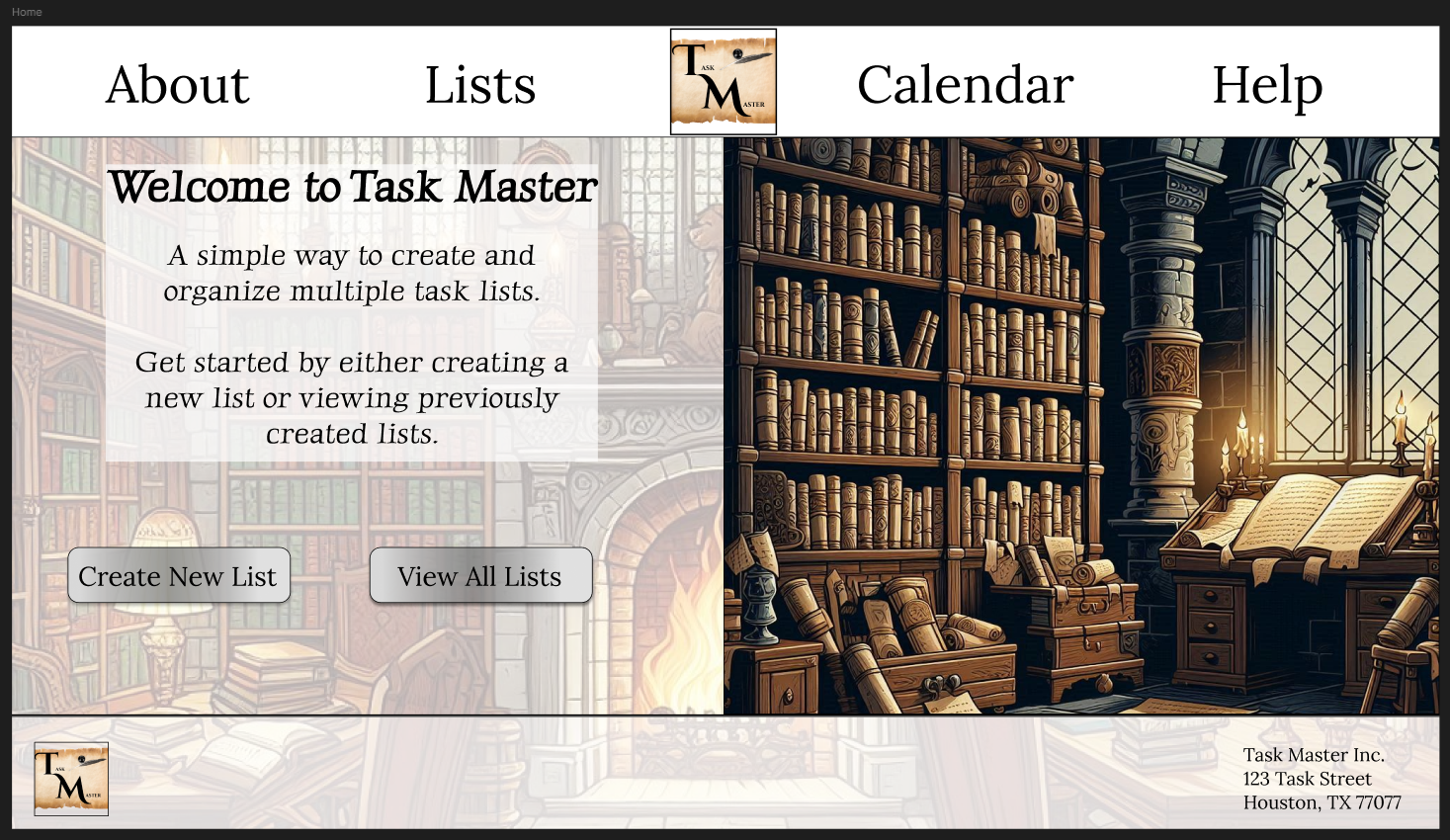
Home Page Mockup
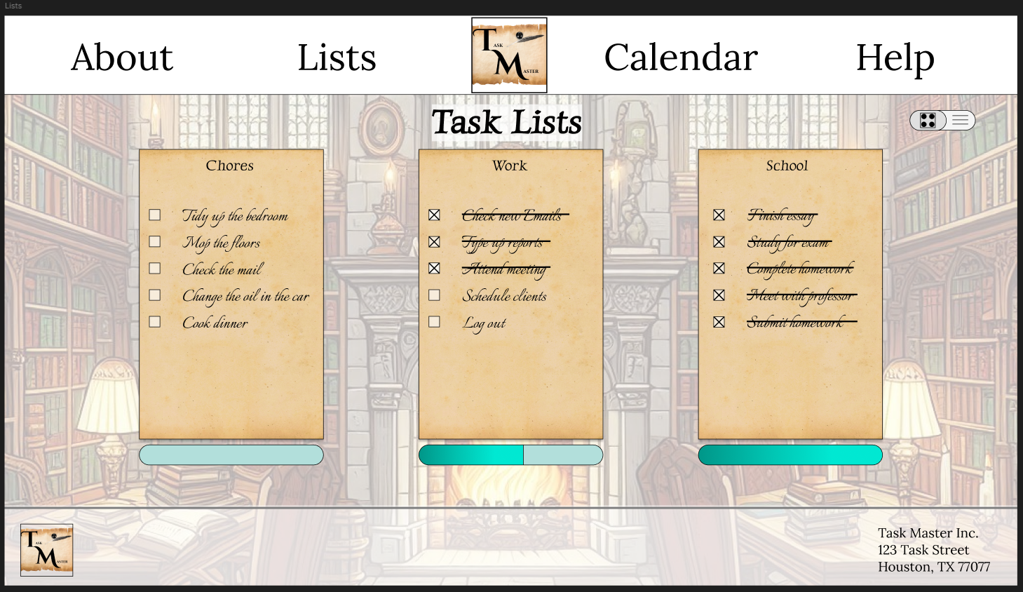
Lists Page Mockup
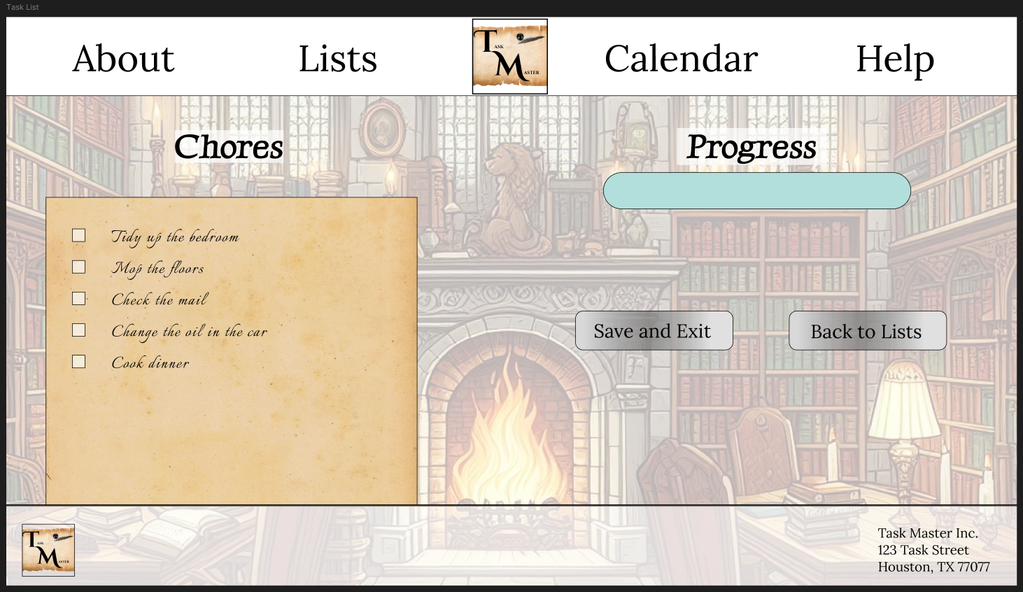
Task List Page Mockup
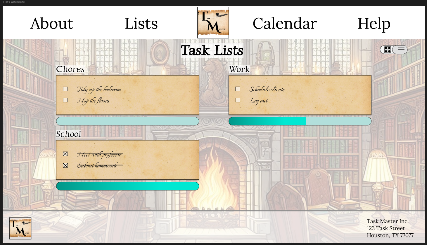
Alternate Lists Page

Takeaways
This project helped me further explore an area of UX design I had less experience with, namely working with desktop sites and larger screens. While I have done previous projects during my certification course designing for a larger screens, this was the first one that was completely self-guided. Having gotten more familiar with designing for mobile screens, I noticed I had been neglecting practicing with desktop screens. Ultimately it is important to be able to design for both. A future project, then, could involve redesigning a mobile app for larger screens or vice versa.
With this particular project, a secondary goal I had was to further explore Figma’s capabilities and to get more practice and familiarity with Figma itself. This time around, I emphasized focusing on animations and meticulously crafted the animations for the Lists page as it switches between layouts. It is a point of pride for this project, though I know there are likely more features and capabilities with Figma that I have yet to use as of right now.
Results
The final design addressed remaining user pain points and added more life to the LoFi wireframes. The user flow remained simple and easy to complete, with a few users expressing a fondness for the fantasy theme. I believe the design accomplished the secondary goal of making the process feel rewarding.


